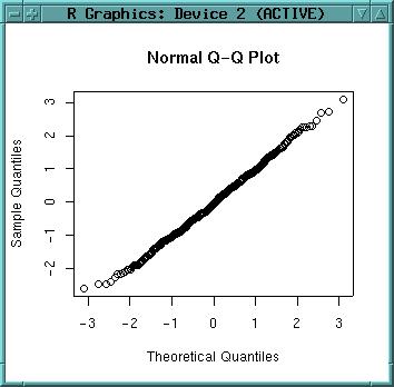
qqnorm(dataset$x)
As the graph is close to the 45° line, is shows normal distribution. As we have generated our variables by rnorm() this was expected. Plot a line which passes through the first and third quartiles:
qqline(dataset$x)
Now we throw away our normally distributed dataframe and use "build-in" demo data for further analysis:
rm(dataset, dataset.new)
There is a nice volcano elevation model (from the description: "Maunga Whau (Mt Eden) is one of about 50 volcanos in the Auckland volcanic field. This data set gives topographic information for Maunga Whau on a 10m by 10m grid"). We just load it:
data(volcano)
To find out about the structure of this dataset (should be a grid, means a matrix):
str(volcano)
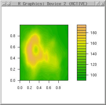
"Filled contours" looks nice with terrain color table:
filled.contour(volcano, col=terrain.colors(30))
Note: You can only display surfaces, if you actually have a surface. The "volcano" dataset is such a data matrix, but the "topo" dataset consists of irregularly distributed elevation points (which need to be interpolated).
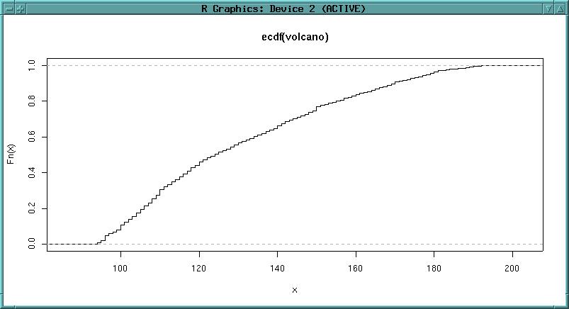
A method to analyse the DEM quality is to use the ECDF (empirical cumulative distribution function):
library(stats)
plot(ecdf(volcano))
plot(ecdf(volcano), verticals=T, do.points=F)
The ecdf function is enveloped by the plot command. The ECDF is also known as hypsometric integral.
We can see that steps in the curve are visible. They indicate interpolation artefacts.
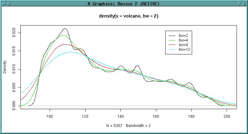
Another function to analyse DEM quality is the density function (smoothed histogram). The function "density" computes kernel density estimates with the given kernel (default: gaussian) and bandwidth. If the DEM was interpolated from contour lines, we can probably see a local over-representation of the contours comparing to the interpolated values (depending on interpolation method). See Jacoby, W.G. (1997) "Statistical graphics for univariate and bivariate data" [p. 23 ff., SAGE publisher] for details:
plot(density(volcano, bw=2))
lines(density(volcano, bw=4), col="green")
lines(density(volcano, bw=8), col="red")
lines(density(volcano, bw=12), col="cyan")
Let's add a legend:
legend(locator(), legend=c("bw=2", "bw=4", "bw=8", "bw=12"),
col=c("black", "green", "red", "cyan"), lty=1)
What is the purpose of density plots? Here the elevation is plotted at different bandwidths (used in kernel density estimation). The black line represents 2m bandwidth, green is 4m bandwidth, black 8m bandwidth for the gaussian kernel. It can be seen that from 4m bandwidth onwards the interpolation artifacts are less intrusive. In conclusion this would require a smoothing of the elevation model using a 8x8 matrix (for example in a GIS or directly in R). There are no general rules to find the optinal bandwidth (according to Jacoby 1997).
--
Sidenote:
#incomplete
Now we try some smoothing of the volcano DEM. To
smooth the elevation values, we need to convert the data structure from
the elevation matrix into a data vector:
zvector <- as.vector(volcano)
str(zvector)
The smooth algorithm expects the value number, which we can generate using the sequence function (from 1 to max value number with stepsize 1):
valuenumber <- seq(1,5307,1)
To smooth the elevation values we will use the kde2d function of the GRASS/R interface (see related text below).
Interpolations are useful especially for irregularly distributed point data. R provides a sample elevation dataset. Loading the "topo" dataset of irregular elevations:
library(MASS)
data(topo)
Before interpolating, we convert the x, y and z values to SI units (see ?topo for original imperial units):
topo.meter <- data.frame(topo$x*0.3048*50, topo$y*0.3048*50, topo$z*0.3048)
names(topo.meter) <- c("x", "y", "z")
str(topo.meter)
rm(topo)
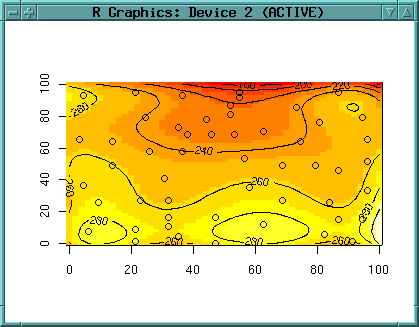
Plot the elevation points, add text labels (pos=1 puts the lables south of the data points, round to get rid of the decimals):
plot(topo.meter$x, topo.meter$y)
text(topo.meter$x, topo.meter$y, round(topo.meter$z), pos=1)
Instead of plotting with the "text" function you can also identify data points by mouse:
plot(topo.meter$x, topo.meter$y)
identify(topo.meter$x, topo.meter$y, labels=topo.meter$z)
Next we want to interpolate a surface. Different interpolation methods are provided by R. Additionally the GRASS interpolation methods could be used (s.surf.rst etc. through "system()" function in R).
approxfun()
library(spatial)
topo.meter.ls2 <- surf.ls(2, topo.meter)
A model description we can get by str():
str(topo.meter.ls2)
summary(topo.meter)
topo.meter.surface2 <- trmat(topo.meter.ls2, 0, 100, 0, 100, 50)
image(topo.meter.surface2)
contour(topo.meter.surface2)
contour(topo.meter.surface2, labcex = 0.8)
image(topo.meter.surface2)
contour(topo.meter.surface2, labcex = 0.8, add=T)
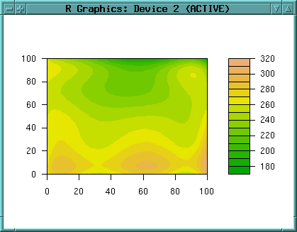
Probably a second order polynom is not sufficient to describe this topo surface. We can try higher polynomial degrees (here: 6th order):
topo.meter.ls6 <- surf.ls(6, topo.meter)

str(topo.meter.ls6)
topo.meter.surface6 <- trmat(topo.meter.ls6, 0, 100, 0, 100, 50)
image(topo.meter.surface6)
contour(topo.meter.surface6, labcex = 0.8, add=T)
points(topo.meter$x, topo.meter$y)
A filled contour plot is also nice (as it provides also a legend):
filled.contour(topo.meter.surface6, col=terrain.colors(20))
Cleaning up the memory:
ls()
rm(topo.meter.surface2, topo.meter.surface6)
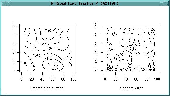
library(modreg)
topo.meter.loess <- loess(z ~ x*y, topo.meter, degree=2, span=0.25, normalize=F)
str(topo.meter.loess)
topo.meter.points <- list(x=seq(0, 100, 1), y=seq(0, 100, 1))
topo.meter.surf <- predict(topo.meter.loess, expand.grid(topo.meter.points), se=T)
par(mfrow=c(1,2))
xlen <- length(topo.meter.points$x)
ylen <- length(topo.meter.points$y)
contour(topo.meter.points$x, topo.meter.points$y, matrix(topo.meter.surf$fit,
        xlen, ylen), xlab="interpolated surface", labcex=0.8)
contour(topo.meter.points$x, topo.meter.points$y,
        matrix(topo.meter.surf$se.fit, xlen, ylen),
        xlab="standard error", labcex=0.8)
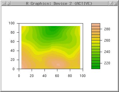
You can try loess with degree=1. For comparison purpose we draw again the filled contours surface (to compare with above trend surface). Because filled.contour wants the x,y coordinates and the z values in a list, we have to convert the data types (converting z into a matrix on-the-fly):
topo.meter.surfaces <- list(topo.meter.points$x,topo.meter.points$y,
                               matrix(topo.meter.surf$fit, xlen, ylen))
names(topo.meter.surfaces) <- c("x", "y", "z")
filled.contour(topo.meter.surfaces, col=terrain.colors(20))
Note the differences to above trend surface (which ignored local effects). Note additionally the sligthly smaller loess surface.
Cleanup:
rm(topo.meter.surfaces, topo.meter.points, topo.meter.surf,
topo.meter.loess)
library(spatial)
par(mfrow=c(1,1))
topo.meter.ls2 <- surf.ls(2,topo.meter)
correlogram(topo.meter.ls2, 10)
....
topo.meter.gls6 <- surf.gls(6, expcov, topo.meter, d=0.7)
str(topo.meter.gls6)
Evaluation of the surface from surface model:
topo.meter.gsurface6 <- trmat(topo.meter.gls6, 0, 100, 0, 100, 50)
Finally look at resulting surface:
image(topo.meter.gsurface6)
contour(topo.meter.gsurface6, labcex = 0.8, add=T)
points(topo.meter$x, topo.meter$y)
filled.contour(topo.meter.gsurface6, col=terrain.colors(20))
Example: Maas contaminated soils sample dataset
[You can start a new session from here, you need GRASS 5.0 to be installed]
In this example the "maas" dataset is used. "maas" represents zinc
measurements as groundwater quality variable along the Dutch bank of the
River Maas just north of Maastricht (source: "gstat" software written by
E.J. Pebesma, http://www.frw.uva.nl/~pebesma/gstat/). Burrough 1998 (pp.102
ff) uses a subset of the same dataset (reduced area). The examples will only
work if R is started from inside GRASS. The data have been reprojected to
UTM zone 32, using the WGS84 ellipsoid. An empty GRASS location has to be
defined with following parameters:
Projection UTM, ellipsoid WGS84, zone 32, north 5652930, south 5650610, west
269870, east 272460, nsres 10, ewres 10, rows 232, cols 259. The pre-defined
GRASS location can also be
downloaded.
To begin, start GRASS with the "maas" location and R within GRASS.
First we load the library of geostatistical functions:
library(sgeostat)
library(GRASS)
G<-gmeta()
Now we load the maas dataset, a dataframe of coordinate pairs and the related zinc concentrations:
data(maas)
str(maas)
plot (maas$x, maas$y); text(maas$x, maas$y, maas$zinc)
data(maas.bank)
lines(maas.bank$x, maas.bank$y, col="blue")
names(maas) <- c("x", "y", "z")
str(maas)
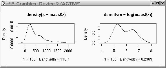
plot(density(maas$z))
plot(density(log(maas$z)))
par(mfrow=c(1,2))
plot(density(maas$z))
plot(density(log(maas$z)))
par(mfrow=c(1,1))
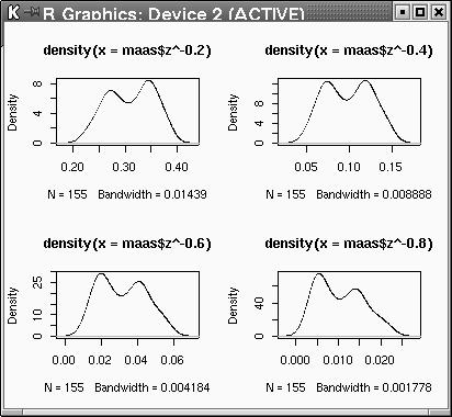
par(mfrow=c(2,2))
plot(density(maas$z^-0.2))
plot(density(maas$z^-0.4))
plot(density(maas$z^-0.6))
plot(density(maas$z^-0.8))
par(mfrow=c(1,1))
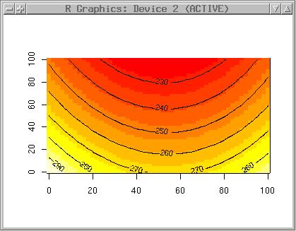
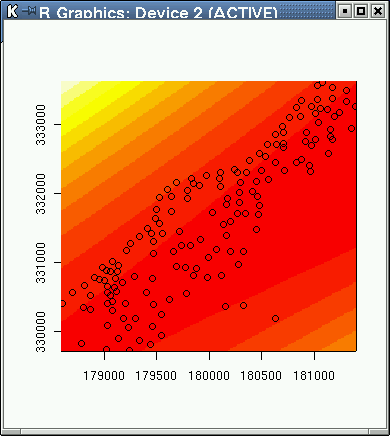
Probably the zinc data have a global trend. A quadratic trend analysis (Least Squares) will tell us more:
library(spatial)
maas.ls2 <- surf.ls(2, maas)
max(maas$x)-min(maas$x)
max(maas$y)-min(maas$y)
(max(maas$y)-min(maas$y))/20
maas.trend2 <- trmat(maas.ls2, min(maas$x), max(maas$x),
                  min(maas$y), max(maas$y), 200)
image(maas.trend2)
points(maas)
text(maas$x, maas$y, maas$z, pos=1)
We will also try to calculate a cubic trend surface:
maas.ls3 <- surf.ls(3, maas)
maas.trend3 <- trmat(maas.ls3, min(maas$x), max(maas$x),
                        min(maas$y), max(maas$y), 200)
image(maas.trend3)
points(maas)
text(maas$x, maas$y, maas$z, pos=1)
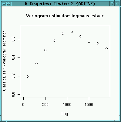
logmaas <- data.frame(x=maas$x, y=maas$y, lz=log(maas$z))
str(logmaas)
logmaas.point <- point(logmaas)
logmaas.pair <- pair(logmaas.point, num.lags=10, maxdist=2000)
print.pair(logmaas.pair)
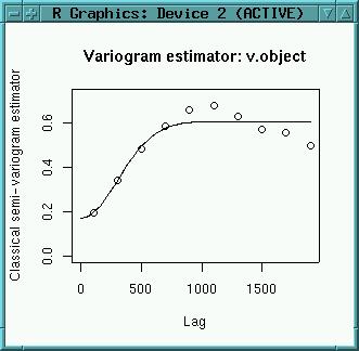
logmaas.estvar <- est.variogram(logmaas.point, logmaas.pair, "lz")
logmaas.estvar
plot(logmaas.estvar)
text(logmaas.estvar$bins, logmaas.estvar$classic/2,
     labels=logmaas.estvar$n, pos=1)
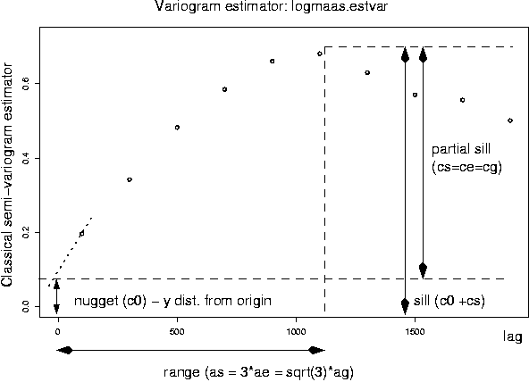
Above image shows the estimated semivariogram. For kriging, we need to fit a variogram model. The function used to generate a variogram model needs some initial values to start up which we have to read from above image. The values are like this:
The general usage is "fit.variogram(model="exponential", estvar, nugget, sill, range, ...)".
ag<-1100/sqrt(3)
ag
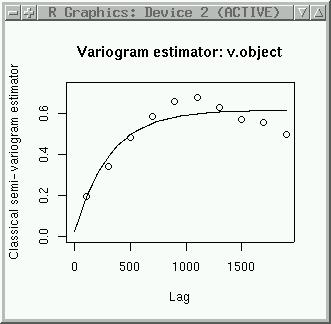
logmaas.varGmod <-fit.variogram("gaussian",
    logmaas.estvar, nugget=0.2, sill=0.5, range=635, plot.it=T,
    iterations=30)
logmaas.varGmod
To fit an exponential variogram model. nugget and can be entered directly, ae has to be calculated (ag=range/3):
ag<-1100/3
ag
logmaas.varEmod <-fit.variogram("exponential", logmaas.estvar,
   nugget=0.2, sill=0.5, range=350, plot.it=T, iterations=30)
logmaas.varEmod
Create a spatially lagged scatter plot, e.g. plot z(s) versus z(s+h), where h is a lag in a pair object:
lagplot(logmaas.point, logmaas.pair, "lz")
plot(logmaas.estvar, logmaas.varGmod)
plot(logmaas.estvar, logmaas.varEmod)
spacebox(logmaas.point, logmaas.pair, "lz")
spacecloud(logmaas.point, logmaas.pair, "lz")
surf.krig<- krige.G(logmaas.point, "lz", logmaas.varEmod, G)
str(surf.krig)
summary(surf.krig$zhat)
summary(surf.krig$sehat)
plot(G, surf.krig$zhat, col=grey(9:2/9))
title("Ordinary kriging predictions ln(Zinc)")
plot(G, surf.krig$sehat, col=grey(9:2/9))
example(krige.G)
l1 <- lm(lz~x+y+I(x^2)+I(y^2)+I(x*y), logmaas)
log$res <- residuals(l1)
logmaas.point <- point(logmaas)
logmaas.pair <- pair(logmaas.point, num.lags=10, maxdist=2000)
logmaas.estvar <- est.variogram(logmaas.point, logmaas.pair, "res")
plot(logmaas.estvar)
--
Further notes
The "dim" command can be used to retrieve cols and rows of a matrix (like
this DEM). We store this information:
topo.cols <- dim(topo)[1]
topo.rows <- dim(topo)[2]
Just entering the object's name tells us about its value(s):
topo.cols
[to be continued one day: distribution tests, regression (nlme), kriging, variograms (nlme, sgeostat), classifications (tree classifier), cluster analysis, point pattern analysis [splancs], time series analysis, neural networks, ...]